Showing posts with label photoshop. Show all posts

How to Create Raining Clouds - Adobe Photoshop Tutorial

Step 1 - New Document

Ok lets get started! First of all we need to create a new Photoshop document, so “File > New” from the menu bar, and I’m going to be using a canvas of 640 pixels wide by 300 pixels high. You can choose a different height but it’s probably easier to work out small first to you can get the detail right.

Step 1 - Making the selection

Ok, so now we have a new canvas set up, we are going to make the basic shape of our cloud. First of all we need to create a new layer, so from the top menu click ” Layer > New > Layer” and I am going to rename this layer ” Clouds “.

Next we are going to select the “Lasso Tool” from the toolbar,which looks like this : When you select the Lasso tool, you will notice that at the top of the screen, your options have changed specifically for this tool. We need to have a feathered selection instead of a hard one, I’m going to increase the Feather to 60px. This allows the clouds to spread out more without having such a hard edge.

Now we are going to simply create a cloud shaped selection using the Lasso tool on our canvas. Here is the shape I made :

Step 3 - Making the clouds

As you have created your new layer, and you have an active selection on the screen, hit “D” on your keyboard to reset the color palette to a black foreground color and a white background. This will ensure that we won’t have strange colored clouds, unless you want to of course! The from the menu, go to “Filter > Render > Clouds”, and you should end up with something like this :

Now we want to duplicate this layer, so from the menu, ” Layer > Duplicate Layer” and rename this layer ” Clouds Overlay”. We want to change the blending mode to ” Hard Light “, so if you navigate to the layers panel and click on the duplicated Clouds layer, there will be an option at the top of the panel selected on Normal. Click this and change to ” Hard Light”. You should end up with something like this :

Step 4 - Adding the gradient

As you can see, our cloud is looking at bit weird with the surrounding white. So we are going to quickly add a blue gradient to the background layer, so you need to click ” Background ” on the layers panel, then from the tools bar, then click the gradient button ( Labeled 1 below ). Ensure you have a decent foreground and background color palette ( Label 2 ) - I’ve used two blues for a sky type background. Then, click and drag your cursor to make a straight gradient, ( Labeled 3 ).

And you should end up with something similar to this :

Step 5 - Creating the rain

Ok this is really simple, all we are going to do is make a new brush. So we are going to make a new document ( File > New ) but don’t close the clouds file we have been working on. I suggest using the same size you did before for the clouds file.

We are going to select a soft round small brush from the brushes menu ( to get to the brushes palette, click the brush tool or hit “B” on the keyboard and from the tool menu click the arrow next to the selected brush, this is illustrated below ).

Let’s reset out color palette to black and white, so hit ” D” on your keyboard. And all we want to do now is create a new layer and click once in the center of our canvas to create a little black dot. ( Labeled 1 below ). Then we want to duplicate this layer ( Layer > Duplicate Layer ).

We now have two layers containing the dot, select the lower layer from the layers panel, then from the top menu click ‘ Filter > Blur > Motion Blur ‘ change the angle to 90 degrees and the distance will define how long your raindrop will be ( I’ve chosen 19 for this example - refer to label 2 below ).

We now want to select the Move Tool, ( The highest icon on the toolbar, or tap ‘V’ on your keyboard ), and just move our blurred rain above the rain dot, labeled in step 3.

Step 6 - Creating a dynamic brush for the rain

Now we have our single drop of rain, select it using the ‘Rectangular Marquee Tool” Hit ‘M’ on your keyboard, and just click down on the canvas and drag to select an area around your drop. We now need to make this into a brush, so click from the menu bar ” Edit > Define Brush Preset” A diag box will pop up, just hit ok.

Now select this newly created brush from the brushes palette ( Check back to step 5 if you can’t remember how ), and your new brush will be the last brush on the list.

When you have selected your brush, you need to open the brushes panel, so from the top menu, ” Window > Brushes “. When this is opened, I am going to change the parameters for the rain brush, i’m going to click ” Scattering ” option, and change the scattering to 1000%.

Step 7 - Adding the rain

We need to open back up the clouds file, and create a new layer ( Layer > New Layer ) and our rain brush is already selected, so change the foreground color to white in the tools panel. All we need to do now is paint on the rain below our clouds! If you like we can erase the top section of the rain using the erase tool ( Hit ‘E’ on the keyboard ) to create a smooth flow!

Here is my finished product!

How to Create a Clean Web 2.0 Style Web Design in Photoshop

How to Create a Clean Web 2.0 Style Web Design in Photoshop

In this Photoshop web design tutorial, you’ll learn, step-by-step, how to create a stunning and clean web layout. You’ll be using some basic to intermediate-level techniques to build your very own sleek "Web 2.0" style web design that uses the 960 Grid System.

This is a two-part series that will teach you how to create the layout in Photoshop, and then how to convert it to a standards-compliant (X)HTML web design.

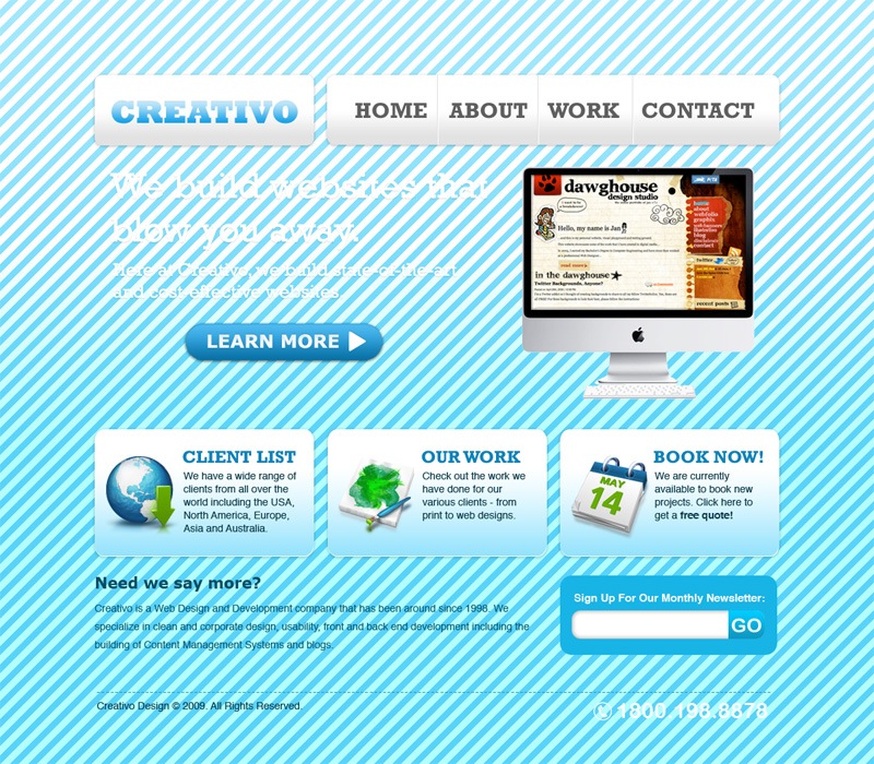
Final Result

Clicking on the image below will take you to the full-scale version of the web layout that we’ll be designing in this tutorial.

Final Result.

Setting up the document

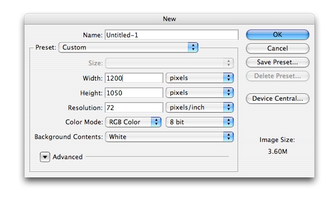
1 Create a new document in Photoshop with the dimensions 1200px x 1050px.

Setting up the document.

Creating the background

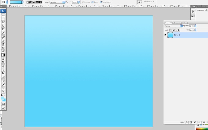
2 Now, we will be creating the background. Select the Gradient Tool (G). Make sure it is set to Linear Gradient. Set the foreground color to #a1e8fe and background color to #59d3fa and create a gradient like below:

Creating the background.

Placing the Grid System into the document

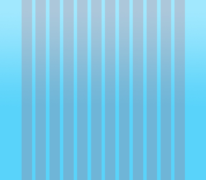
3 On a new layer, create a 960px wide grid - 12 bars, each bar at 60px wide. Place each bar 20px apart from each other. Place the grid at the center of the document. The grids should serve as your guide and it is recommended that the main elements of your design do not exceed the width of the grid. The 960 Grid System is an effort to streamline web development workflow by providing commonly used dimensions, based on a width of 960 pixels. Go to the 960 Grid System site for more information, or download the Grid system here.

Grid System.

Making containers for the logo and navigation items

4 We will now be creating the containers for the logo and the navigation items. To create the containers, use the Rounded Rectangle Tool with Shape Layers selected. Set the radius to 10px.

Making containers for the logo and navigation items

Making containers for the logo and navigation items

5 Create a rounded rectangle 300px wide. Create a second rounded rectangle 620px wide; they should be situated on the grid as follows:

Making containers for the logo and navigation items

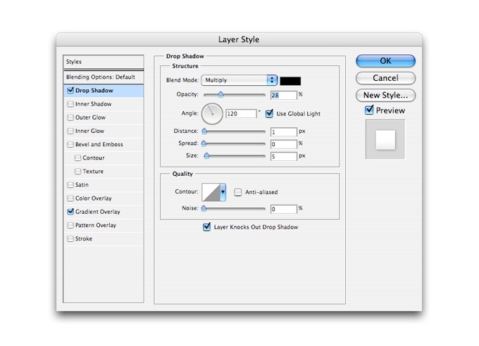
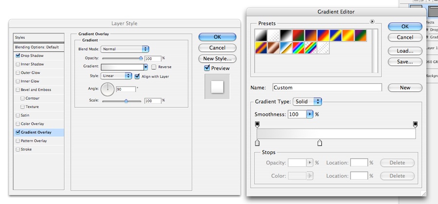
6 Apply these Layer Style settings to each rounded rectangle:

Making containers for the logo and navigation items

Making containers for the logo and navigation items

Your rounded rectangle should now look like this:

Making containers for the logo and navigation items

Inputing the logo and navigation text

7 To create the navigation items, use the Type Tool (T). Use the color #5f5f5f. In this case, I used the font Rockwell. Add the navigation items to the second rectangle and the company logo (current logo being used is just a fictional name for a design agency) to the first.

Making containers for the logo and navigation items

Making separators for navigation items

8 On a new layer, let us add a separator in between each navigation item. Here I added a line with the color #dedede.

separators.

9 Duplicate the separator. Use Layer > Layer Style > Blending Options > Color Overlay and change the duplicate’s color to #ffffff. Move the duplicate one pixel to the right. This will create a subtle engraved effect.

Separators.

Creating the site header

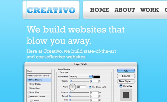
10 Now let’s create the header below the logo and the navigation. Using the Type Tool (T), add the company tagline and a brief introduction below it. Let us then add a slight Drop Shadow to it to give it more dimension.

Site header.

11 To fill up the empty space next to the tagline, add a photo of a computer or laptop. This is what you should have by now:

site header.

Create a rounded button

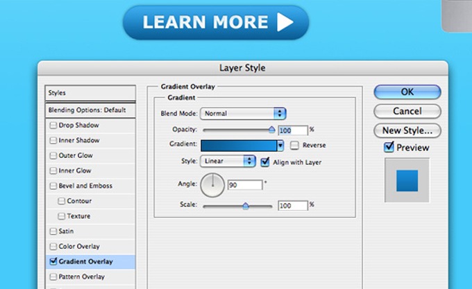
12 Below the brief introduction, with the use of the Rounded Rectangle Tool with 28px radius, create a button that says "Learn More". This is very helpful so that if users want to find out more about your company, this information is easily accessible.

Learn More.

Apply a Gradient Overlay to the button using the settings above with #086da0 as the bottom color and #23a7ea as the top color.

Creating a call-to-action box

13 Using the Rounded Rectangle Tool once again with 16px radius, create a 300px rectangle. Go to Blending Options and add a Drop Shadow with the same values as Step 6.

Radius.

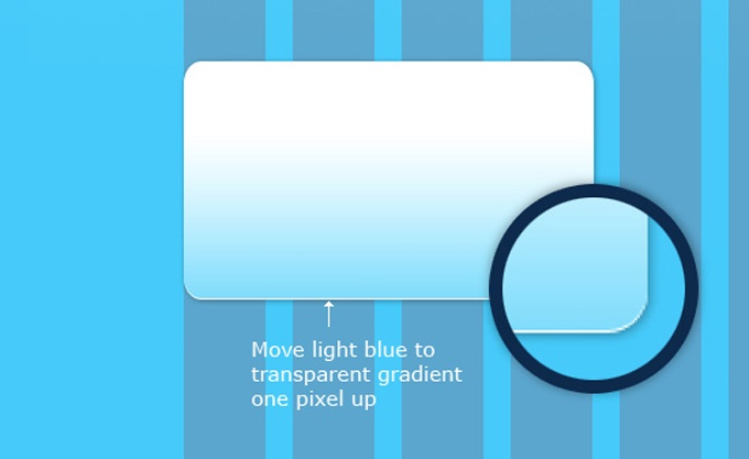
14 Select the rectangle we just created (Cmd/Ctrl + Click) and create a new layer above this rectangle. Add a light blue (#96e3fc) to transparent gradient over the rectangle.

Rectangle selection.

15 Move this gradient one pixel up. This may be a very minute detail but let us be keen to that. It somehow makes it look a little different as opposed to having just an ordinary gradient box.

Gradient Box.

Crafting a call-to-action button

16 This box will serve as a call-to-action button. These are helpful if you want users to find important information on your site all at one glance. Let us add a heading, some description, and an icon to our buttons. Icons, as small as they may seem, help bring more appeal to your designs. They also assist users in promptly finding what they are looking for because icons communicate messages to users without them having to read their accompanying texts.

The awesome icons I am using in this tutorial are from Wilson Ink on DeviantArt. You can check them out and download them; The icon set is called the Green and Blue Icon Set. These icons are free for personal use only; if you intend to use the design in tutorial for commercial purposes, substitute these icons to one that allows you to do so.

call to action.

17 Duplicate the box we just created along with its content twice, and then distribute them across the grid evenly. Change the content of the two new boxes as you please. It’s recommended that you change the content of each box rather than just duplicating them and having them all the same. This makes the design look more like a real, navigable website rather than just a lazily done mockup (helpful for presenting to clients).

Duplicate.

18 To add more content to the design, we can add some text below the three boxes, for example, a newsletter section would be great. But don’t forget to keep everything inside the grid!

Add content.

Last but not least… the footer

19 Next, we create the footer where we can add the copyright and the contact information for the website.

Footer.

Icing on the cake: creating the diagonal lines

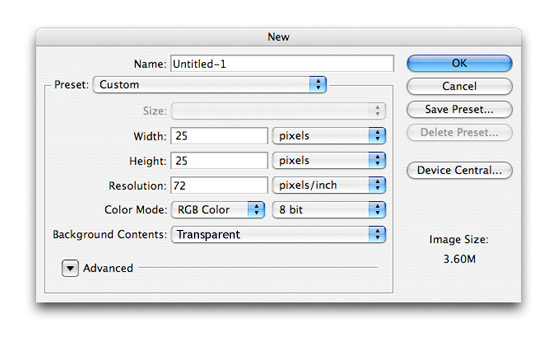
20 Create a new document in Photoshop with the dimensions 25px x 25px and fill the entire document with a black (#000000) background.

New Document

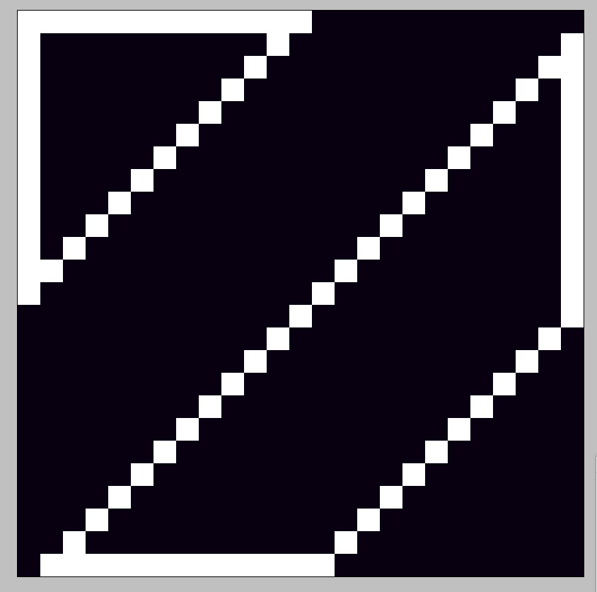
21 On top of the layer with the black background, create a new layer. Using the Zoom Tool (Z), zoom in the document to its maximum size so we can see clearly. Set the Pencil Tool to 1px and foreground color to white (#FFFFFF). Draw lines on your document just like the picture below. Take note of how many pixels you need to draw and which areas on the document you need to draw them on.

New Layer.

Connect the lines just like this:

Connect the lines.

Fill the empty areas with white to achieve this result:

Final result of pattern.

22 Hide the layer with the black background and go to Edit > Define Pattern. The layer with the black background was created only to make the white more visible. Name your brush “diagonals” and hit OK.

23 Now let us go back to the mockup we just created. Create a new layer above the gradient background. Go to Edit > Fill and on the Contents dropdown, use Pattern. Click on Custom Pattern and look for the pattern we just created named “diagonals” and hit OK. You should see something like this:

Diagonals.

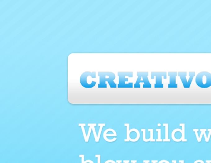
24 Set this layer’s Blend Mode to Overlay and its Opacity to 4%. You should now have something like this:

Change Blend Mode.

25 From bottom to top and using an ordinary feathered eraser, erase off about 60% of the diagonal lines to make it look like this:

Erase some.

Details.

26 Voila! We now have a very clean, nice-looking, Web 2.0 style website design! Stay tuned for the follow-up tutorial where Jacob will show you how to convert this design into a working (X)HTML template!

Final.

Source